De-lumping the Hershey Fonts
The biggest problem with using the Hershey fonts is that they are constructed from sequences of line segments. At large sizes, they tend to look blocky. Besides, why spend all of that time adding Bézier splines to twin only to not have glyphs take advantage of them.
I tried to come up with an automatic mechanism for identifying sequences of strokes in each glyph which could be replaced by a spline, but I eventually gave up and figured that with a reasonable tool, I could manually identify the points. It turns out that this wasn't sufficient; I had to also insert new points and delete existing points before fitting splines. That's because the glyphs all have nice flat spots on the horizontal and vertical edges of each circle, a Bézier spline wants to terminate in the middle of these flat spots.
Fortunately, I have cairo to help build applications now. What a relief. Constructing the font editor took a couple of hours, with incremental adjustments as I started to edit each glyph. The new glyphs use quite a bit less memory than the old, enough so that I could add pre-computed snapping arrays and metrics to each glyph which makes the glyph painting code a lot simpler.
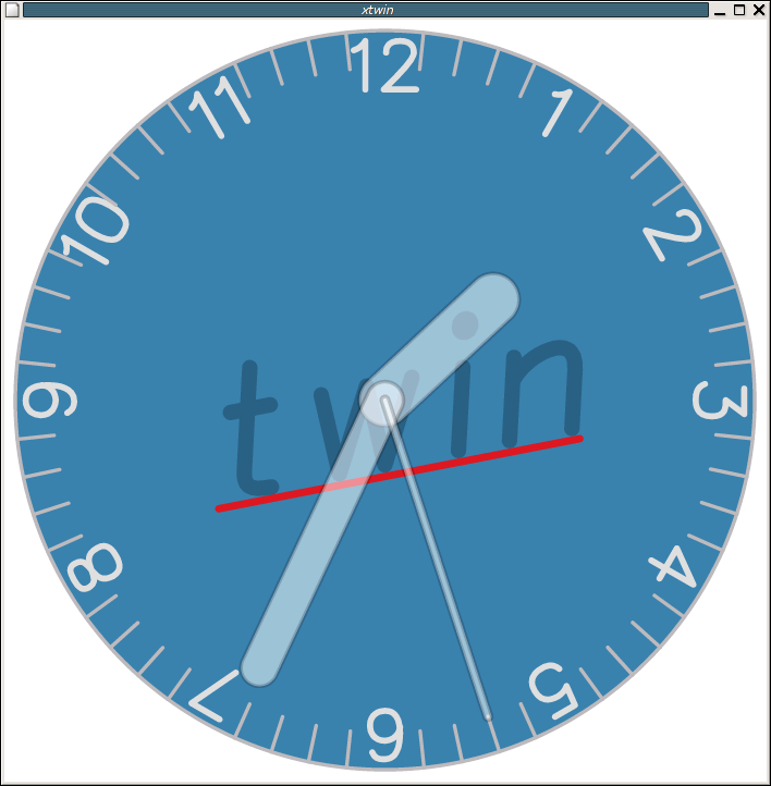
The twin clock also continues to improve in appearance; take a look at the latest incarnation, which includes the pretty new text.